
The Psychology Behind High-Converting Websites
Design doesn't convert visitors. Psychology does. The websites that quietly outperform their competitors are built on principles that have nothing to do with how the site looks — and everything to do with how the human brain decides.
Most business owners think their website needs to look better. In reality, what it usually needs is to feel different — clearer, calmer, more confident. The websites that quietly outperform their competitors are built on principles that have nothing to do with how the site looks and everything to do with how the human brain decides.
Conversion isn't a design problem. It's a psychology problem. And the good news is that the principles that govern how visitors choose to enquire, call, or close the tab are surprisingly stable. They're rooted in decades of behavioural research, and once you understand them, every section of your website starts to make sense in a new way.
First impressions form in about 50 milliseconds
Research from Google and Carleton University has consistently shown that visitors form a first impression of a website in around 50 milliseconds. That's roughly the time it takes to blink. They aren't reading anything yet. They aren't even sure what the business does. But they've already decided whether the site feels professional, trustworthy, and worth a few more seconds of their attention.
This is why the visual hierarchy of your hero section — the colour palette, the spacing, the clarity of the headline, the quality of the imagery — matters far more than most business owners realise. It isn't vanity. It's the visual equivalent of a first handshake. Get it wrong and the rest of the website never gets read.
Cognitive load is the silent killer of conversions
Every visitor arrives with a finite amount of mental energy. Every confusing layout, every overloaded menu, every paragraph of jargon spends a little of that energy. When the energy runs out, the visitor leaves. They don't think "I'll come back later" — they just close the tab and move on.
The best-performing websites obsess over reducing cognitive load. They use plain language, generous white space, and predictable layouts. They don't ask the visitor to figure anything out. They simply guide them, one obvious step at a time, towards the next action. The lower the cognitive load, the higher the conversion rate.
Social proof works because we're wired for it
When humans are uncertain, we look at what others have done. It's not weakness — it's evolutionary efficiency. We can't possibly evaluate every decision from scratch, so we use the behaviour of others as a shortcut. On a business website, this manifests as testimonials, reviews, case studies, client logos, star ratings, and specific outcomes.
But not all social proof is created equal. Vague testimonials ("Great service, highly recommend!") barely register. Specific testimonials with names, locations, and concrete outcomes ("We saw a 40% increase in bookings in the first three months") do real work. The more specific and credible the proof, the more powerfully it operates beneath the visitor's awareness.
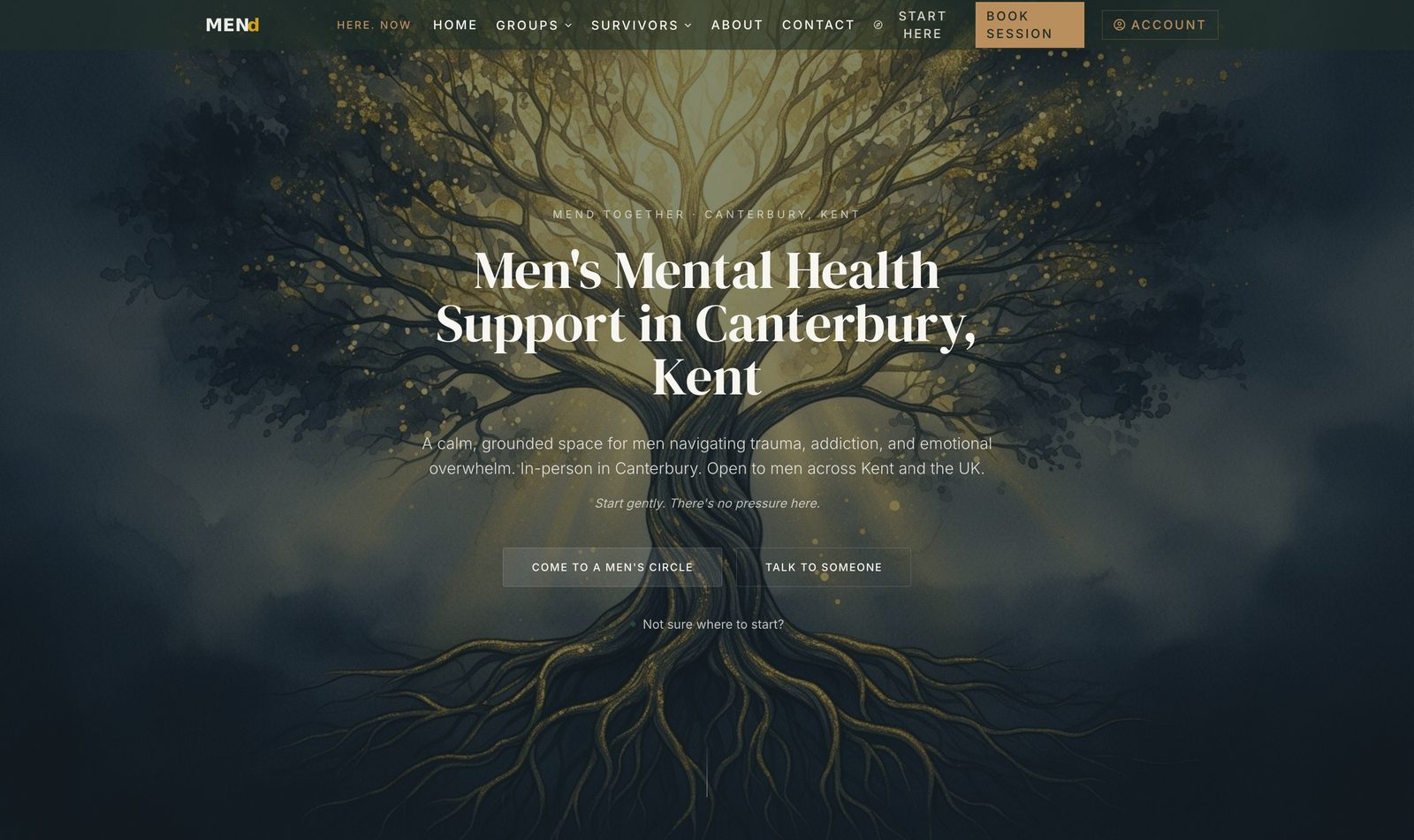
A men's mental-health platform that quietly reaches the men who need it most.
MENd Together is a CIC supporting men with trauma and emotional recovery. We rebuilt the digital surface from the ground up so the right men could find it on Google, trust it on first visit, and reach out without friction.
Read the case studyFree Business Growth Report
Discover how visible your business really is.
A personalised report on your local demand, visibility opportunities, growth barriers and revenue potential — built specifically for your business.
- Local demand
- Visibility opportunities
- Growth barriers
- Revenue potential
- Recommended next steps
The principle of reciprocity
Robert Cialdini's research on persuasion identified reciprocity as one of the most powerful drivers of human behaviour. When someone gives us something of value, we feel a quiet pull to give something back. On a website, this principle is why free guides, free audits, free consultations, and even thoughtfully written articles outperform pure sales pages by enormous margins.
The Free Business Growth Report works for exactly this reason. It gives the visitor something genuinely useful before asking for anything in return. By the time they finish reading their report, the question isn't "should I work with this company?" but "what would it look like if we did?"
Loss aversion is roughly twice as strong as gain
The Nobel-prize-winning work of Kahneman and Tversky showed that people feel the pain of losing something about twice as intensely as the pleasure of gaining the equivalent. For website copy, this has a very practical implication: framing the cost of inaction often outperforms framing the upside of action.
Compare "Increase your enquiries by 30%" with "Stop losing 30% of your potential enquiries to invisible competitors." Both are factually equivalent. The second is psychologically more powerful, because it surfaces a loss the visitor hadn't yet thought about. Used thoughtfully — and never manipulatively — loss framing can dramatically improve how a website performs.
Decision fatigue: fewer choices, more action
The famous "jam study" by Sheena Iyengar found that a display of 24 jams attracted more browsers but produced ten times fewer purchases than a display of just 6. More choice doesn't help — it paralyses. On a business website, this shows up in over-stuffed menus, three competing calls-to-action in the hero, and pricing pages with ten tiers.
The fix is unglamorous but extremely effective: reduce. One primary call-to-action per page. A maximum of five top-level menu items. Two or three clearly differentiated pricing options. Every choice you remove makes the choice that remains feel easier and more obvious.
Microcopy is doing more work than you think
The small words on your buttons, form labels, and tooltips quietly shape conversion. A button that says "Submit" feels transactional. A button that says "Get my free growth report" feels like a step towards something the visitor wants. The difference can move conversion rates by 20% or more on the same page.
The best microcopy mirrors the language the visitor uses in their own head. It's specific, warm, and oriented around the outcome — not the action. Read every button on your site and ask: would I click this if I'd never heard of the company? If the answer is "probably not," rewrite it.
How to apply this to your business
You don't need to rebuild everything. Start with the highest-leverage elements — the hero section, the primary call-to-action, the testimonials, and the contact form. Make each one clearer, more specific, and more aligned with how visitors actually think. Then measure what changes.
Most websites have enormous untapped conversion potential sitting inside their existing traffic. The businesses that quietly grow are the ones that understand the psychology — and stop redesigning when what they really need is to rewrite.
For a fuller picture of why visitors leave without taking action, read our pillar article on why most business websites don't generate enquiries.
Free Business Growth Report
Discover how visible your business really is.
A personalised report on your local demand, visibility opportunities, growth barriers and revenue potential — built specifically for your business.
- Local demand
- Visibility opportunities
- Growth barriers
- Revenue potential
- Recommended next steps
Read next · Websites
Keep reading


Related services