
10 Website Mistakes Costing Small Businesses Customers
These aren't theoretical mistakes. They're the ones we see on roughly nine out of every ten small-business websites we audit — and each one quietly costs enquiries every single month.
These aren't theoretical mistakes pulled from a blog post template. They're the ones we see on roughly nine out of every ten small-business websites we audit — and each one quietly costs enquiries every single month. Most are easy to fix once you know to look for them.
1. The headline doesn't say what the business does
The single most common mistake on small-business websites is a headline that sounds clever but communicates nothing. "Welcome to our story." "Bringing your vision to life." "Excellence, every time." Visitors who land on the homepage should be able to answer three questions in three seconds: what do you do, who do you do it for, and where? If your headline doesn't tell them, you've already lost most of them.
2. There's no obvious call to action above the fold
Even when the offering is clear, many sites bury the next step. The phone number is in tiny text. The contact form lives four scrolls down. The "Book now" button is in a dropdown menu. A primary call-to-action should be visible the moment the page loads — clear, well-positioned, and using language that matches what the visitor actually wants.
3. The site is slow on mobile
Google research suggests that mobile conversion rates drop by around 20% for every additional second of load time. And yet most small-business websites haven't been speed-tested in years. Oversized hero images, unused plugins, and bloated template code add up to load times of 6, 8, even 12 seconds on a 4G connection. Every one of those seconds is bleeding visitors.
4. Testimonials feel generic or unverifiable
"Best service ever — Jane" is barely a testimonial. It feels invented because, for all the visitor knows, it might be. Real testimonials include full names, locations, specific outcomes, and ideally a photograph or company logo. The more specific and verifiable they feel, the more powerfully they operate as trust signals.
5. The contact form asks for too much, too soon
Asking for name, email, phone, company, role, address, postcode, project budget, project timeline, and how they heard about you in a single form is a near-guaranteed way to halve your enquiries. Start with the minimum — usually name, email, and one or two specifics. You can always ask more once the conversation has started.
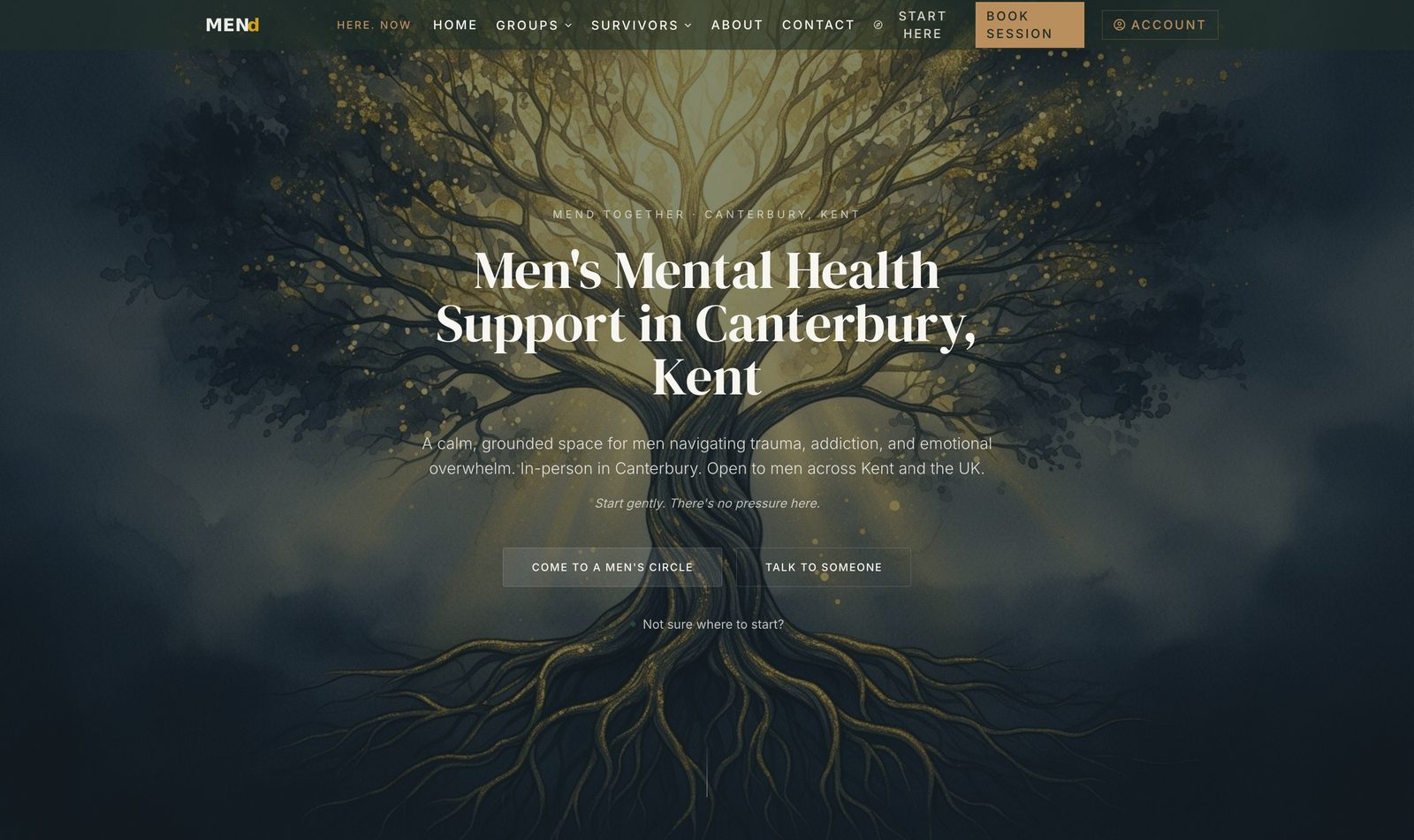
A men's mental-health platform that quietly reaches the men who need it most.
MENd Together is a CIC supporting men with trauma and emotional recovery. We rebuilt the digital surface from the ground up so the right men could find it on Google, trust it on first visit, and reach out without friction.
Read the case studyFree Business Growth Report
Discover how visible your business really is.
A personalised report on your local demand, visibility opportunities, growth barriers and revenue potential — built specifically for your business.
- Local demand
- Visibility opportunities
- Growth barriers
- Revenue potential
- Recommended next steps
6. The site doesn't mention the locations it serves
Many small-business websites mention the location once, in the footer, and assume that's enough. Google sees almost no signal that the business serves a specific area, and prospective customers can't tell whether the business is local enough to be relevant. Locations should appear in headings, body copy, page URLs, schema, and image alt text — naturally, but consistently.
7. There's no proof the business does what it claims
Claims without proof are forgettable. "We help small businesses grow" is a claim. "We helped a Canterbury accountancy practice go from 8 enquiries a month to 31" is proof. Case studies, before-and-after results, screenshots of analytics, photos of completed work — anything that converts an abstract claim into a concrete outcome.
8. The mobile experience is an afterthought
A site that looks beautiful on a designer's 27-inch display often falls apart on a 6-inch screen. Buttons are too small to tap. Forms scroll off the side of the page. Menus require pinching to navigate. Given that mobile is now usually the majority of traffic, the mobile experience isn't a secondary concern — it's the primary one. Read our deep-dive on mobile website design for the full picture.
9. There's no analytics in place — or nobody reads them
You can't improve what you can't see. If you don't know where visitors come from, which pages they read, where they drop off, and which calls-to-action they ignore, you're optimising in the dark. Even a basic analytics setup, reviewed monthly, will tell you more about your website's performance than a year of guessing.
10. The site has never been updated since launch
A website that hasn't been touched in three years looks like a website that hasn't been touched in three years — even if the design is technically still fine. Visitors notice. Google notices. New content, fresh case studies, and visible signs of an active business operate as quiet trust signals that compound over time.
What to fix first
You don't need to address all ten at once. The highest-leverage fixes are usually the headline, the primary call-to-action, the mobile experience, and the testimonials. Get those right and most of the others become easier to tackle. For the underlying reasons all of this matters, our pillar article on why most business websites don't generate enquiries is the place to start.
Free Business Growth Report
Discover how visible your business really is.
A personalised report on your local demand, visibility opportunities, growth barriers and revenue potential — built specifically for your business.
- Local demand
- Visibility opportunities
- Growth barriers
- Revenue potential
- Recommended next steps
Read next · Websites
Keep reading


Related services