
Websites For Therapists: What Actually Converts
Therapy websites have a uniquely delicate brief: be warm enough to feel safe, professional enough to feel credible, and clear enough to convert hesitant visitors into first sessions. Most miss two of those three.
Therapy websites have a uniquely delicate brief: be warm enough to feel safe, professional enough to feel credible, and clear enough to convert hesitant visitors into first sessions. Most miss two of those three.
The visitor on a therapy website is rarely browsing
They're often anxious, often researching for the first time, often deciding whether to take an emotional risk. Every design and copy decision should account for that. Tone matters more than aesthetics. Specificity matters more than completeness. The visitor is asking "can I trust this person with what I'm carrying?" — and the website needs to answer in the first ten seconds.
Specificity beats breadth
"I work with adults experiencing trauma, anxiety, and relationship difficulties" outperforms "I help with a range of mental health concerns." Niche specificity — trauma therapist for men, EMDR for emergency responders, couples counselling for new parents — converts dramatically better because it tells the right visitor "you're in the right place."
Photos that feel real
Stock images of strangers on cliff tops kill conversion. A real photograph of the therapist, ideally in their actual room, builds more trust than any copy line. The room itself sends signals — calm, professional, considered. If photographing the therapist isn't possible yet, calm, neutral interior photography of the actual space is the second-best option.
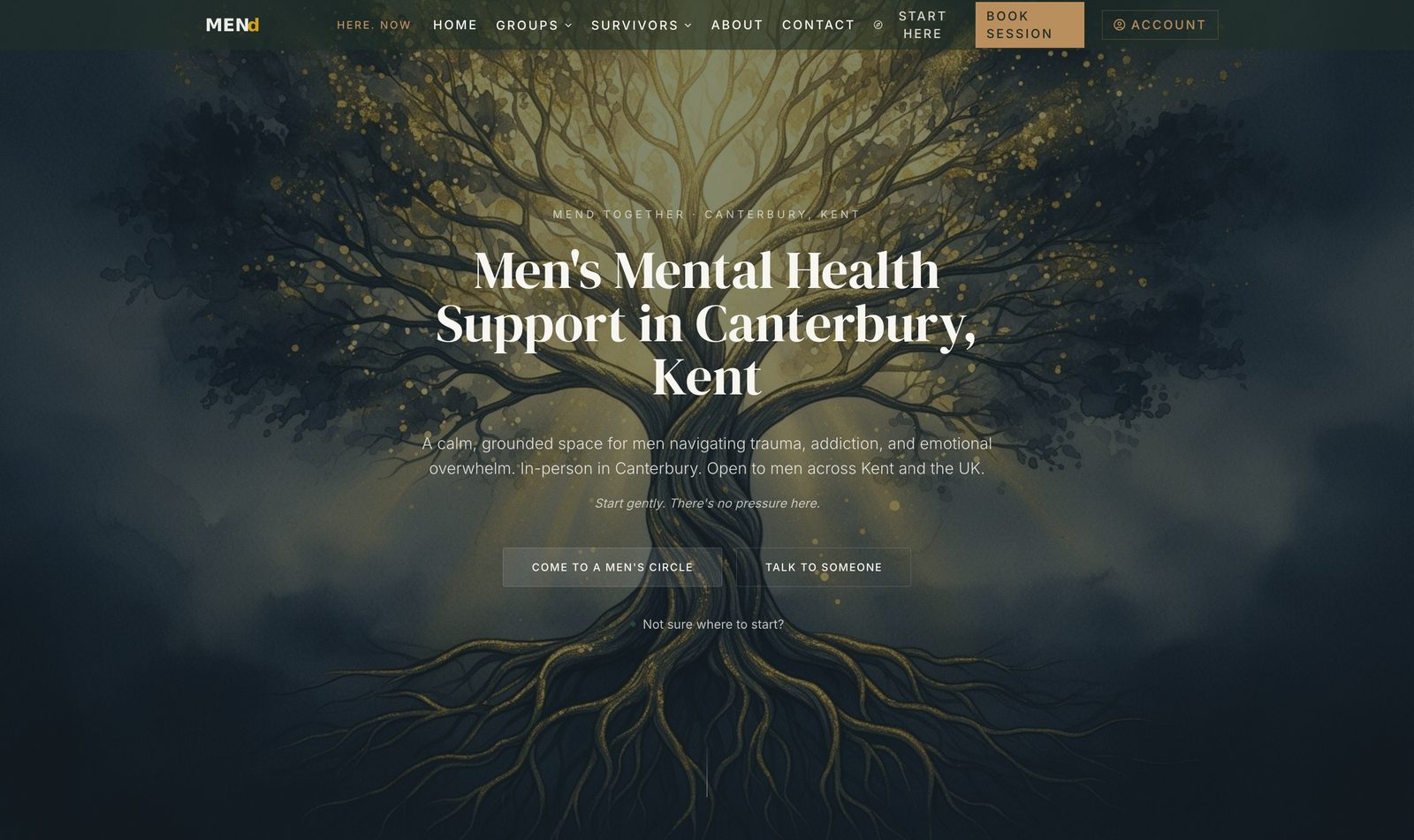
A men's mental-health platform that quietly reaches the men who need it most.
MENd Together is a CIC supporting men with trauma and emotional recovery. We rebuilt the digital surface from the ground up so the right men could find it on Google, trust it on first visit, and reach out without friction.
Read the case studyFree Business Growth Report
Discover how visible your business really is.
A personalised report on your local demand, visibility opportunities, growth barriers and revenue potential — built specifically for your business.
- Local demand
- Visibility opportunities
- Growth barriers
- Revenue potential
- Recommended next steps
Credentials clearly, accreditation prominently
BACP, UKCP, BABCP, or equivalent registration logos in the footer and on the about page. Years of experience stated plainly. Modalities listed without jargon. The visitor is verifying — make verification fast.
The contact step is the hardest moment
Reaching out for therapy is non-trivial. The contact form should be as short as humanly possible: name, email, one optional sentence. Add a clear response-time commitment ("we typically reply within one working day"). Avoid asking probing intake questions on the public form — those belong in the first session, not the doorstep.
A short FAQ removes huge friction
Cost. Session length. In-person or online. First-session expectations. Confidentiality basics. Cancellation policy. Five answers can lift conversions noticeably because they remove the unknowns that make hesitant visitors close the tab.
For more, see our pillar on why most business websites don't generate enquiries.
Free Business Growth Report
Discover how visible your business really is.
A personalised report on your local demand, visibility opportunities, growth barriers and revenue potential — built specifically for your business.
- Local demand
- Visibility opportunities
- Growth barriers
- Revenue potential
- Recommended next steps
Read next · Websites
Keep reading


Related services